Thomas Coad - A2 Media
Friday, 4 May 2012
Wednesday, 2 May 2012
NEW Video Game TV Advert 2 (Remake)
After analysing my audience feedback, I change my second advert to make it aimed more at the target audience.
Wednesday, 25 April 2012
NEW Video Game TV Advert 2
This is the second new and improved TV advert that I have made for my Media coursework.
NEW Video Game TV Advert 1
This is the first new and improved TV advert that I created for my Media coursework.
NEW Video Game Digipak Design
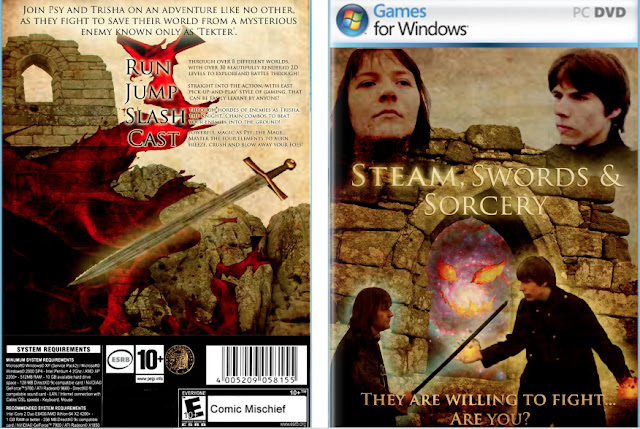
This is the new and improved digipak design that I have made for my Media coursework, improving greatly on the older version.
Video Game Title
For this project, I have looked into a way of making an effective and professional looking video game title. Firstly, I needed to choose a suitable font for the text. This font had to be representative towards both the genre of the game and the game play style of the game. Here is an example of a game title that has done this:
From looking at this title, it can be assumed by the target audience that the game is set in a fantasy world. This is because of the texture of the font, which looks cracked and withered, symbolising age. The text is also very chunky and coloured a rusty orange colour, which could connote to wealth or power. All of these aspects can be used when working towards my own video game title, as many of them relate to the specific genre my video game is based around.
This is another example of an existing video game title.
This title is stylised in such a way that it appears to look futuristic. Several aspects connote to this, such as the colour scheme. Many futuristic games use metallic coloured font (usually chrome) that has hardly any rounded edges. This all connotes to machinery and industry.
This is the final design for the title that I created in Adobe After Effects.
The font that I used indicates to an old, medieval style, while still looking quite new and fresh. I also created the effect of the title being underground, with streams of light and dust. THis all connotes to mystery and age, which works well with the font.
Friday, 30 March 2012
Finalized Advert 1
This is the final TV advert of the video game. This version is the longer and more detailed version. It would be played occasionally on television, because of it's length.
Subscribe to:
Comments (Atom)


